Documentation for Mapping Cicero’s Letters Project

“Mapping Cicero’s Letters” is a project for the Kenyon College course “The Ends of the Earth in the Ancient Imagination.” In 2016, 2018, and 2020, students enrolled in the course analyzed selections of Cicero’s letters for geo-spatial information. They learned to create original tabular data and how to format it for visualization in Carto. They also learned to apply SQL statements to manipulate their data, and to use CSS to customize the resulting maps. Here are some examples of their work. We intend to continue the project in future iterations of the course.

We are making our documentation available along with instructional screencasts for anyone who would like to recreate or adapt the project.

We recommend starting with our quick introduction to Carto. This video will teach you how to make a simple digital map:

The videos below explain the ten steps that students went through to create their visualizations in Carto. You will find documentation and template files after the videos.

1. Introduction to the assignment

2. Accessing the letters in Loeb Classical Library Online (access to LCL requires a subscription)

3. Reading and analyzing the letters

4. Introduction to Excel points file

5. Consulting Pleiades

6. Introduction to Excel journey segment file

7. Uploading to Carto

8. Scattering points in Carto

9. Drawing lines in Carto

These videos were originally created when this course was taught remotely in spring 2020.

Documentation and templates:

  1. Assignment and Workflow
  2. Points Template
  3. Journey Segments Template
  4. Start Point IDs Template
  5. End Point IDs Template
  6. Instructions for Scattering Points in Carto
  7. Instructions for Drawing Lines from Scattered Points in Carto

Students also consulted D.R. Schackleton Bailey’s commentaries on Cicero’s letters for help locating the author and recipient of the letters.
Mapping Ancient Texts: Recent Presentations

Second International Classics Conference in Ghana. University of Ghana, Legon (December, 2022)

Cicero Digitalis: Cicero and Roman Thought in the Age of Digital Humanities. Remote Conference Sponsored by the Università del Piemonte Orientale (February, 2021)

Teaching Classics in the Digital Age (June, 2020): https://www.ancientcities.eu/teaching-classics-congress (A video of this presentation is available here: https://cloud.rz.uni-kiel.de/index.php/s/2jBoYTc39qm7PxW

SCS Annual Meeting (January, 2020): https://classicalstudies.org/annual-meeting/2020/151/preliminary-program-2020-annual-meeting

University of Pittsburgh (November, 2019): https://www.classics.pitt.edu/event/micah-myers-mapping-ancient-texts-digital-visualizations-classics-teaching-and-research

Mapping Hannibal

Mapping Hannibal

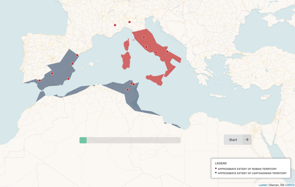
“Mapping Hannibal” represents a new type of digital visualization for the Mapping Ancient Texts project (MAT). MAT student-researcher Daniel Olivieri (Kenyon ‘19) won a 2018 Kenyon Summer Digital Scholarship award to develop the project. “Mapping Hannibal” is a geo-referenced digital visualization about the major events in the life of Hannibal Barca, with a particular focus on the Second Punic War. The final product maps Hannibal’s movements during his lifetime, following him from his childhood in Carthage to his years of leadership in Spain, through his momentous victories in Italy, and finishing with his defeat at the battle of Zama and eventual exile from Carthage.

Visualizing this sort of geo-referenced narrative presented new and exciting challenges for MAT. After researching Hannibal and the Second Punic War, Daniel used Leaflet to create info-boxes that are geo-referenced on a Carto map layer. The info-boxes contain a summary of the relevant events that occurred in a given location (e.g., a battle), as well as links to primary and secondary sources. Presented with the challenge of narrating a long and complex story succinctly, Daniel added a glossary that allows readers to learn more about different historical figures and events without leaving the website. The resulting glossary, made using modal boxes, features over twenty entries covering important individuals, groups, and major battles. The latter are visualized with GIFs created by Daniel that animate reconstructions of the conflicts.

Daniel used the Semantic UI library to establish an attractive and consistent style throughout the site. He used JSON objects to hold the data for each point and for each entry in the glossary. In order to show the approximate extent of Roman and Carthaginian territory, he used Carto’s polygon feature. Through a progress bar at the bottom of the map, the site gives users a sense of how far along they are in the narrative.

In its completed form, “Mapping Hannibal” makes a famous event in Roman history available in a novel way through a digital medium. “Mapping Hannibal” emphasizes space and place; incorporates maps as well as other types of visualization, especially GIFs; and relates the narrative in a manner that is approachable, but that also provides links to primary sources, such as Polybius and Livy, and fundamental secondary sources, like the Oxford Classical Dictionary. We hope that Mapping Hannibal will be of interest to students and enthusiasts at all levels as well as to others working on digital mapping and data visualization.